
Principal Components Analysis in IDL
QUESTION: I hear a lot of people talking about Principal Components Analysis (PCA) with respect to images and other data in IDL, but I don't know the first thing about it. Can you help me learn how to do this in IDL?
![]()
ANSWER: If you are just coming to Principal Components Analysis (PCA) for the first time, or you are not sure what it is, or if you are like me and your eyes glaze over when confronted with the arcane symbolism of mathematical formulas, do yourself a favor. Stop reading this nonsense for an hour and go read Lindsay I. Smith's marvelous PCA tutorial, entitled, naturally enough, A Tutorial on Principal Components Analysis. Go ahead, I'll wait. And when you get back, I'll show you how to work the examples in Lindsay Smith's tutorial in IDL, show you why I think some of Smith's examples are wrong, and maybe a few other things that will be useful to you.
![]()
Later...
Whoa! Back so soon? Good. And I'll bet for the first time in your life you understand what the terms standard deviation, variance, covariance matrix, eigenvectors, and eigenvalues mean, don't you? I hope so. This is a practical tutorial, not a theoretical one.
Ok, so Principal Components Analysis is a technique for analysing the variances or differences (also called the covariances) in two or more data sets. In the end, you will get a set of orthogonal, or completely uncorrelated, vectors that describe the differences in your data. These are the eigenvectors. You will have as many eigenvectors as you have data sets you are comparing. Note that if you are comparing more than three data sets, you will be on your own visualizing higher dimensional orthogonal spaces. I hope you have read lots of science fiction!
You will also get a set of matching numbers, called the eigenvalues. These eigenvalues can be ordered from largest to smallest. (Be sure when you order them you also order the corresponding or matching eigenvector.) The magnitude of these eigenvalues is a measure of how much of the difference between your data sets can be explained by its corresponding vector. These vectors and values are also called the principal components of the differences in your data. The vector with the largest eigenvalue is called the first principal component of the differences and explains most of the differences in your data, the vector with the next largest eigenvalue is called the second principal component and explains most of the differences not explained by the first vector, and so on.
Depending on the purpose of your analysis, you can reconstruct or transform your data, using one or more (or all) of your principal components. PCA analysis is often performed, for example, on multispectral image data sets. In Landsat data, to give an example, one might perform PCA analysis on all seven bands, then reconstruct the image with just the first one or several principal components. This would have the effect of reducing the noise in the data. Reconstructing the image with just the first principal component often enhances the topographic features of the data and provides an image with more contrast, almost as if the image was high-pass filtered.
![]()
The Lindsay Smith Analysis
To begin the Lindsay Smith analysis, we first construct some data in IDL.
    x = [2.5, 0.5, 2.2, 1.9, 3.1, 2.3, 2.0, 1.0, 1.5, 1.1]
   y = [2.4, 0.7, 2.9, 2.2, 3.0, 2.7, 1.6, 1.1, 1.6, 0.9]
We wish to analyze the differences between these two data sets. It might help to understand what we are doing to see the data plotted. But before we do that, let's subtract the mean value of the data from each element of the array. Subtracting the mean or average is something that is almost always done before PCA analysis is started. When you reconstruct your data, be sure to remember to add the means back in.
    xmean = x - Mean(x, /DOUBLE)
   ymean = y - Mean(y, /DOUBLE)
Now, let's draw a plot of the data.
   Window, XSIZE=500, YSIZE=350, TITLE='Plot of Original Data (Means Subtracted)', 0
   Plot, xmean, ymean, BACKGROUND=cgColor('ivory'), COLOR=cgColor('navy'), $
      /NODATA, POSITION=Aspect(1.0), XRANGE=[-2,2], YRANGE=[-2,2]
   OPlot, xmean, ymean, PSYM=7, COLOR=cgColor('indian red'), THICK=2, SYMSIZE=1.5
   OPlot, [-2, 2], [0,0], LineStyle=2, COLOR=cgColor('gray')
   OPlot, [0,0], [-2, 2], LineStyle=2, COLOR=cgColor('gray')
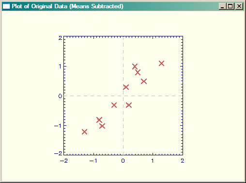 |
| Plot of original data, with means subtracted. |
Just by inspection you can see that the data goes from the lower-left corner of the plot towards the upper-right corner of the plot. We would expect at least one of the principal component vectors to be oriented in this way. If fact, if we were to draw a best-fit line though the data, we could say that this line "explains" the data to some extent, since it shows us where a new data point might appear in our plot. That is, there is a very good chance it might appear close to the line we drew through the data. But how close?
If we drew another vector or line orthogonal or perpendicular to the first vector, we could make the length of that vector proportional to the possibility that a new data point would be that close to the first line. We could say that the second vector could "explain" the how far the points are likely to be from the first vector. (You could envision a box containing the endpoints of the two vectors that enclose all the known data points. The length and orientation of the box would explain the general trend of the data, and with height of the box would explain the general spread of the data along the trend line.) As you will see, this is essentially what we are going to do with PCA.
To perform PCA in IDL we need to create a covarience matrix. We can do that with the CORRELATE command in IDL. The only requirement is that the data we wish to compare be represented as column vectors in the array we pass into CORRELATE.
[Note that CORRELATE can also be used to tell use the degree of correlation between these two vectors. Remember, in correlation, values go from -1 to 1. A value of 0 is uncorrelated, negative values are negatively correlated (i.e., a change in one vector will predict an opposite change in the other), whereas positive value are positively correlated (i.e., a change in one vector will predict a similar change in the other). Values of -1 or 1 tell us the data is either perfectly negatively correlated, or is perfectly positively correlated. In our case, CORRELATE(xmean, ymean) = 0.925929, which means our data is highly positively correlated. Highly correlated data like this, as you will see, will result in a large first principal component when we do the PCA analysis.]
To turn the data into a column array and construct the covarience matrix, we enter these commands in IDL. Be sure you do all the computations in PCA in double precision arithmetic if you are concerned with accurate results.
    dataAdjust = Transpose([ [xmean], [ymean] ])
   covMatrix = Correlate(dataAdjust, /COVARIANCE, /DOUBLE)
Because we are comparing two data sets, the covarience matrix will be a two-by-two array.
    IDL> Print, covMatrix
      0.61655552      0.61544444       0.61544444      0.71655558
We can use the covarience matrix to calculate the eigenvalues and eigenfunctions with the EIGENQL command in IDL. Note that the eigenvectors are returned from the function via the output keyword EIGENVECTORS.
eigenvalues = EIGENQL(covMatrix, EIGENVECTORS=eigenvectors, /DOUBLE)
We can see the results.
    IDL> Print, eigenvalues
        1.2840277     0.049083401     IDL> Print, eigenvectors
        0.67787338      0.73517867         0.73517867     -0.67787338
Note that the first row (not column) of the eigenvector array corresponds to the first eigenvalue. In our case, the first eigenvector is also the first principal component vector (because the matching eigenvalue is the largest of the two) of the analysis. In fact, the first eigenvector can explain 96% of the differences in the data.
IDL> Print, (1.2840277) / Total(eigenvalues) * 100 96.318129
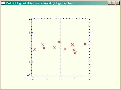
Let's draw the original data again, only this time we will add the eigenvectors to the plot.
   Window, XSIZE=500, YSIZE=350, TITLE='Plot of Original Data with Eigenvalues Added', 1
   Plot, xmean, ymean, BACKGROUND=cgColor('ivory'), COLOR=cgColor('navy'), $
      /NODATA, POSITION=Aspect(1.0)
   OPlot, xmean, ymean, PSYM=7, COLOR=cgColor('indian red'), THICK=2, SYMSIZE=1.5
   xx = cgScaleVector(Findgen(11), -2, 2)
   OPlot, eigenvectors[0,0]*xx, eigenvectors[1,0]*xx, Color=cgColor('Charcoal'), Thick=2
   OPlot, eigenvectors[0,1]*xx, eigenvectors[1,1]*xx, Color=cgColor('Charcoal'), Thick=2
   OPlot, [-2, 2], [0,0], LineStyle=2, COLOR=cgColor('gray')
   OPlot, [0,0], [-2, 2], LineStyle=2, COLOR=cgColor('gray')
The results are shown in the figure below. This figure corresponds to Figure 3.2 in Smith.
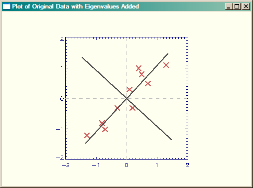 |
| Plot of original data, with eigenvectors added. |
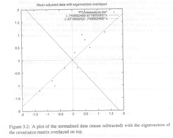
Now, note that the signs of the eigenvectors are reversed from those found in the Smith tutorial. Of course, the signs of the eigenvectors are completely arbitrary, but I still think the Smith figure is wrorg. And, I even have some evidence for this. If you look at Figures 3.2 and 3.3 in the Smith tutorial, I think it is clear that the data in Figure 3.3 are reversed from what they should be. Pay particular attention to the three data points close together in the upper right-hand quadrant in Figure 3.2. These are placed, incorrectly I think, in negative Y space in Figure 3.3.
 |
 |
| Figures 3.2 and 3.3 from Smith Tutorial. Data in Fig 3.3 are reversed. |
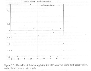
Let's create the Smith Figure 3.3 from our data, and I think you can see it looks correct. First, we will create the feature vector from both of the principal components, and transform it. The feature vector is composed of as many eigenvectors as we choose to reconstruct the data. The result will have as many dimensions as the number of eigenvectors we choose to put into the feature vector. Please remember that the eigenvectors are stored in the rowsof the eigenvector matrix, not in the columns. In this case, since we are going to reconstruct the entire data set, the feature vectors is composed of all the eigenvectors. Note that to create the final data, we need row matrices, which means we have to transpose the original data matrix before we perform the matrix multiplication.
    featureVector = eigenvectors
   finalData = featureVector ## Transpose(dataAdjust)
Then we plot the transformed data.
   Window, XSIZE=500, YSIZE=350, TITLE='Plot of Original Data with Eigenvalues Added', 2
   Plot, finalData[*,0], finalData[*,1], BACKGROUND=cgColor('ivory'), COLOR=cgColor('navy'), $
      /NODATA, POSITION=Aspect(1.0), XRANGE=[-2,2], YRANGE=[-2,2]
   OPlot, finalData[*,0], finalData[*,1], PSYM=7, COLOR=cgColor('indian red'), THICK=2, SYMSIZE=1.5
   OPlot, [-2, 2], [0,0], LineStyle=2, COLOR=cgColor('gray')
   OPlot, [0,0], [-2, 2], LineStyle=2, COLOR=cgColor('gray')
The results are shown in the figure below. Do you agree that this looks more correct than the Smith tutorial?
 |
| Smith Figure 3.3, but created correctly in IDL (I think). |
Next, we are going to see how much of the difference in our data can be explained by just the first principal component of the data. To do this, we create a new feature vector from the first principal component of the analysis, and transform the data with that. Again, note that we have to take the transpose of both the feature vector and the original (adjusted) data and also that the transformed data will have the same number of dimensions as the number of principal component vectors used to create the data. Here, since we are using only one principal component, the data will be one-dimensional. (That is, the transformed data should all fall on a line.)
   featureVector = eigenvectors[*,0] ; The first ROW!!
   singleVector= featureVector ## Transpose(dataAdjust)
We can plot the data with these commands.
   Window, XSIZE=500, YSIZE=350, TITLE='Data Transformed with First Principal Component', 3
   Plot, finaldata[*,0], singleVector, BACKGROUND=cgColor('ivory'), $
      COLOR=cgColor('navy'), /NODATA, POSITION=Aspect(1.0)
   OPlot, finaldata[*,0], singleVector, PSYM=7, COLOR=cgColor('indian red'), $
       THICK=2, SYMSIZE=1.5
   OPlot, [-2, 2], [0,0], LineStyle=2, COLOR=cgColor('gray')
   OPlot, [0,0], [-2, 2], LineStyle=2, COLOR=cgColor('gray')
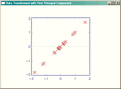 |
| Data transformed with one principal component. |
Of course, to reconsitute our original data, we have to add the means that we subtracted in the first step, back into the data. Here is a plot of the final data, but rotated by the eigenvectors into non-correlated orthogonal vector space.
   rotatedOrigData = finalData + Rebin([Mean(x), Mean(y)], 2, 10)
   Window, XSIZE=500, YSIZE=350, TITLE='Original Data, Rotated by Eigenvectors', 4
   Plot, rotatedOrigData [*,0], rotatedOrigData [*,1], /NODATA, $
      BACKGROUND=cgColor('ivory'), COLOR=cgColor('navy'), POSITION=Aspect(1.0)
   OPlot, rotatedOrigData [*,0], rotatedOrigData [*,1], THICK=2, $
       COLOR=cgColor('indian red'), SYMSIZE=1.5, PSYM=7
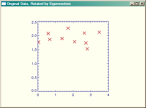 |
| Original data, rotated by eigenvectors. |
![]()
Doing PCA with the IDL command PCOMP
QUESTION: Well, I tried doing the Smith tutorial with the PCOMP command in IDL, and I didn't get anything like the numbers you did. Shouldn't PCOMP give me the same results you did in the analysis above?
![]()
ANSWER: In fact, it does give the same results, if you realize that PCOMP scales the results by the square root of the eigenvalues, a fairly common procedure (apparently) in PCA analysis. Consider the following code and results.
   x = [2.5, 0.5, 2.2, 1.9, 3.1, 2.3, 2.0, 1.0, 1.5, 1.1]
   y = [2.4, 0.7, 2.9, 2.2, 3.0, 2.7, 1.6, 1.1, 1.6, 0.9]
   xmean = x - Mean(x, /DOUBLE)    ymean = y - Mean(y, /DOUBLE)
   dataAdjust = Transpose([ [xmean], [ymean] ])
   fd = PCOMP(dataAdjust, /COVARIANCE, EIGENVALUES=evalues, COEFFICIENTS=evectors, /DOUBLE)
Compare the eigenvalues. These are the same without changes.
    IDL> Print, 'Previous Analysis: ', eigenvalues
        Previous Analysis:   1.2840277     0.049083400
   IDL> Print, 'PCOMP Analysis:    ', Transpose(evalues)
        PCOMP Analysis:      1.2840277     0.049083400
And compare the eigenvectors. These are the same, if the PCOMP eigenvectors are divided by the square-root of corresponding eigenvalue.
   IDL> Print, 'Previous Analysis: '    IDL> Print, eigenvectors
        Previous Analysis:               0.67787338      0.73517868
           0.73517868     -0.67787338     IDL> Print, 'PCOMP Analysis:    '
   IDL> Print, evectors / Rebin(SQRT(evalues), 2, 2)         PCOMP Analysis:
          0.67787338      0.73517868           0.73517868     -0.67787338
Similarly, the output is identical if the PCOMP output is divided by the square-root of the corresponding eigenvalue.
   IDL> Print, 'Data From Previous Analysis: '
   IDL> Print, Transpose(rotatedOrigData)           2.6379703       2.0851154
        0.032419715       1.7671428           2.8021977       1.5256251
          2.0842105       1.7795829           3.4858014       2.1194986
          2.7229492       1.7347176           1.7108906       2.2598248
         0.66542790       1.8635828           1.3719539       1.8922355
         0.58617948       2.0726754
   IDL> Print, 'Data From PCOMP Analysis:    '
   IDL> pcompRotatedOrigData = fd / Rebin([SQRT(evalues[0]), SQRT(evalues[1])], 2, 10)
   IDL> pcompRotatedOrigData = pcompRotatedOrigData + Rebin([Mean(x), Mean(y)], 2, 10)
   IDL> Print, pcompRotatedOrigData           2.6379703       2.0851154
        0.032419715       1.7671428           2.8021977       1.5256251
          2.0842105       1.7795829           3.4858014       2.1194986
          2.7229492       1.7347176           1.7108906       2.2598248
         0.66542790       1.8635828           1.3719539       1.8922355
         0.58617948       2.0726754
An IDL main-level program containing all the IDL commands used so far is available for downloading.
![]()
Principal Components of Images
You see in the figure below bands 2,3,4, and 5 of a Landsat image of an Antarctic ice stream. The bands have been linearly scaled to give the best contrast. We are going to perform principal component analysis on these four image bands to demonstrate how PCA might be used with images.
[Editor Note: After writing an article on EOF Analysis, which is identical to Principal Component Analysis, I have a feeling this section of the article might be slightly misleading. Let's just say, I wouldn't do it this way if I were doing the analysis again now.]
The following commands are used to display the images. (Note that cgSTRETCH was used to select appropriate minimum and maximum values for best visible contrast.)
    !P.MULTI=[0,2,2]
   Window, XSIZE=500, YSIZE=500, Title="LandSat Image Bands 2,3,4, and 5", 6
   TVImage, BytScl(b2, MIN=100, MAX=130)
   XYOuts, 20, 270, /Device, 'Band 2', Color=cgColor('Gold')
   TVImage, BytScl(b3, MIN=110, MAX=140)
   XYOuts, 270, 270, /Device, 'Band 3', Color=cgColor('Gold')
   TVImage, BytScl(b4, MIN=85, MAX=110)
   XYOuts, 20, 20, /Device, 'Band 4', Color=cgColor('Gold')
   TVImage, BytScl(b5, MIN=10, MAX=20)
   XYOuts, 270, 20, /Device, 'Band 5', Color=cgColor('Gold')    !P.MULTI = 0
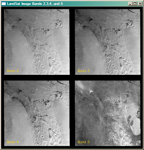 |
| Landsat bands 2,3,4 and 5 of an Antarctic ice stream. |
These four Geotiff files were read into IDL in the normal way with READ_TIFF. The images are all the same size and the images are named b1 through b3. The first step is to create a data array of the four images for construction of the covariance matrix. The following commands are used.
   dim = Size(b2, /Dimensions)    bands = FltArr(4, dim[0] * dim[1])
   bands[0,*] = Reform(b2 - Mean(b2), 1, dim[0] * dim[1])
   bands[1,*] = Reform(b3 - Mean(b3), 1, dim[0] * dim[1])
   bands[2,*] = Reform(b4 - Mean(b4), 1, dim[0] * dim[1])
   bands[3,*] = Reform(b5 - Mean(b5), 1, dim[0] * dim[1])
   covMatrix = Correlate(bands, /COVARIANCE, /DOUBLE)
Next, we calculate the eigenvectors and eigenvalues.
eigenvalues = EIGENQL(covMatrix, EIGENVECTORS=eigenvectors, /DOUBLE)
When we print the eigenvalues, we see that this data is (as we might expect from a multi-channel sensor) highly correlated. The first principal component of the eigenvalues accounts for over 99% of the variance in the data.
    IDL> Print, eigenvalues
          957.65660       2.4729513       1.3086518      0.66366324
   IDL> Print, 'First Component (%): ', eigenvalues[0]/Total(eigenvalues)*100
           First Component (%):        99.537963
Finally, we reconstruct the image, rotating by the eigenvectors.
   pc = eigenvectors ## Transpose(bands)
   pc = Reform(Temporary(pc), dim[0], dim[1], 4)
The figure below shows the four principal component images. The following code was used to generate them. As before, cgSTRETCH was used to select an appropriate minimum and maximum value for best contrast.
    !P.MULTI=[0,2,2]
   Window, XSIZE=500, YSIZE=500, Title="Principal Component Images 1-4", 7
   TVImage, BytScl(pc[*,*,0] + Mean(b2), MIN=85, MAX=125)
   XYOuts, 20, 270, /Device, 'PC Image 1', Color=cgColor('Gold')
   TVImage, BytScl(pc[*,*,1] + Mean(b3), MIN=115, MAX=135)
   XYOuts, 270, 270, /Device, 'PC Image 2', Color=cgColor('Gold')
   TVImage, BytScl(pc[*,*,2] + Mean(b4), MIN=29, MAX=37)
   XYOuts, 20, 20, /Device, 'PC Image 3', Color=cgColor('Gold')
   TVImage, BytScl(pc[*,*,3] + Mean(b5), MIN=-34, MAX=-4)
   XYOuts, 270, 20, /Device, 'PC Image 4', Color=cgColor('Gold')    !P.MULTI = 0
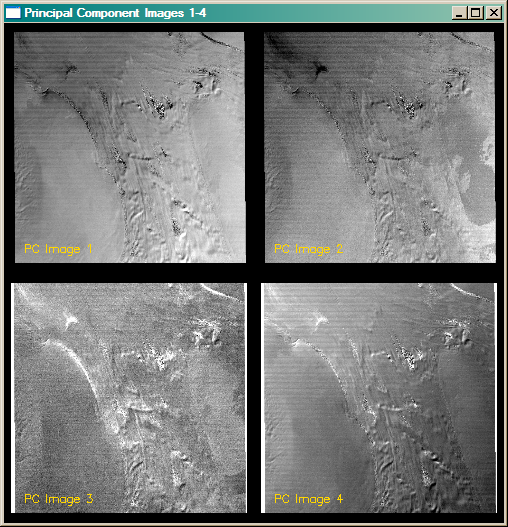 |
| The four principal component bands of the Landsat images. |
With Landsat images, the first principle component image is usually, but not always, the best image to work with if you are interested in topographical information. That appears to be the case here, although you might argue for the fourth principal component image, too. Do note, however, that PC image 4 is in reversed color from PC image 1. Usually you will want to choose the PC image that is most similar to your original images. A great deal of the noise in the image is isolated in the third principal component image.
![]()
Discussion Source
If you are interested in learning more about this topic, the IDL discussion that peaked my interest in writing a tutorial can be found here.
![]()
Copyright © 2007-2008 David W. Fanning
Written 3 September 2007
Updated 28 July 2008