
Nice Fonts in the Z-Buffer
QUESTION: I do a lot of work in the Z-graphics buffer and I would like to use nice looking fonts. You would think hardware fonts would be the way to go, but I tried this:
   Nice (hardware) fonts in 'X'... no problem!
   Nice (hardware) fonts in 'PS'... no problem!
   Nice (hardware) fonts in 'Z'... now there's a problem!
I thought the Z-device would know about the fonts available in 'X', but that is not the case. I even tried device, Set_Font = 'Times' and although I did not get an error, I got vector fonts!
What's a Z-device user to do!?
![]()
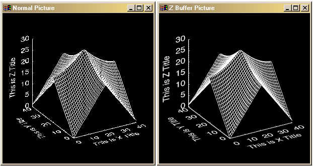
ANSWER: I like to use true-type fonts in the Z-buffer, but you have to use the ol' "make-um big" trick to make them look really nice. Here is a short example program that demonstrates what happens if you blow true-type fonts up to four times the size you need in the Z-buffer. The output below shows you the normal and enhanced looks of the fonts.
![]()
Last Updated 24 September 2002