
Teaching an Elephant to Dance: Contour Plots in IDL 8.1
QUESTION: I want to create the very simplest contour plot imaginable, using the IDL 8.1 function graphics routine Contour(), but I am making no headway at all. Can you please show me how to do this?
I have data that ranges in value from 0 to 1. I want to display this data as a filled contour plot in which four colors are used to represent the data ranges 0.00 to 0.25, 0.25 to 0.50, 0.50 to 0.75, and 0.75 to 1.00. The colors I would like to use are red, blue, green, and yellow, respectively.
The contour plot I want to create in IDL 8.1 can be created in any version of IDL with these Coyote Graphics commands.
   data = RandomU(-3L, 9, 9)
   levels =[0.0, 0.25, 0.5, 0.75]
   TVLCT, cgColor(['red', 'blue', 'green', 'yellow'], /TRIPLE)
   cgContour, data, LEVELS=levels, C_COLORS=Indgen(4), $
       POSITION=[0.1, 0.1, 0.9, 0.8], /FILL
   cgContour, data, LEVELS=levels, C_COLOR='charcoal', LABEL=1, $
       C_CHARSIZE=1.0, /OVERPLOT
   cgColorBar, NCOLORS=4, RANGE=[0,1], FORMAT='(F0.2)', $
       DIVISIONS=4, /FIT, MINOR=5, XTICKLEN=1.0
You see the output I am looking for in the figure below.
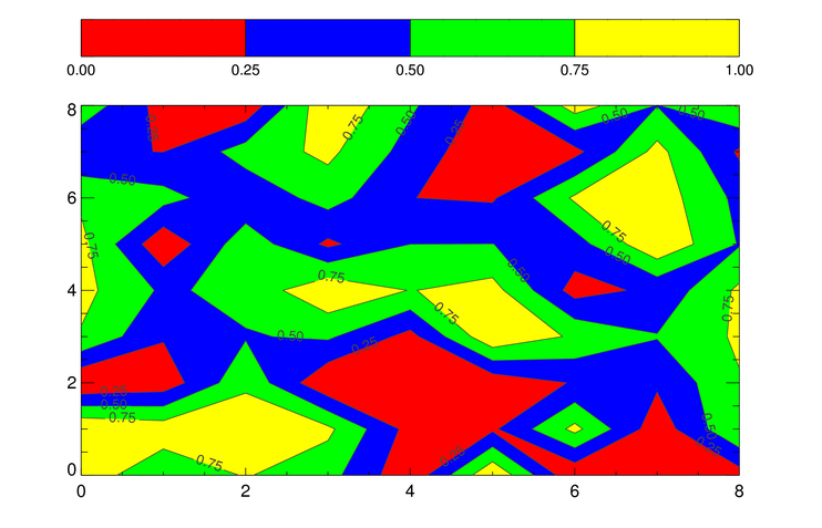 |
| A simple filled contour plot created with Coyote Graphics commands. |
After puzzling over the "documentation" for some number of hours, I have determined that the equivalent sequence of IDL 8.1 function graphics commands must be something like this.
   data = RandomU(-3L, 9, 9)
   LoadCT, 0
   TVLCT, 255, 0, 0, 0   ; Red
   TVLCT, 0, 0, 255, 1   ; Blue
   TVLCT, 0, 255, 0, 2   ; Green
   TVLCT, 255, 255, 0, 3 ; Yellow
   TVLCT, rgb, /GET
   levels = [0.0, 0.25, 0.5, 0.75]
   w = Window(DIMENSIONS=[750, 400])
   c = Contour(data, /CURRENT, C_VALUE=levels, /FILL, $
       POSITION=[0.1, 0.1, 0.9, 0.8], AXIS_STYLE=2, $
       RGB_TABLE=rgb, RGB_INDICES=Indgen(4))
   cb = Colorbar(TARGET=c, POSITION=[0.1, 0.90, 0.9, 0.95])
But, as you can see in the figure below, that doesn't work very well. Can you help?
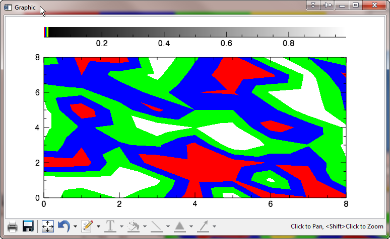 |
| First attempt at creating the same plot as above, using IDL 8.1 graphics routines. |
![]()
ANSWER: Yes, well, the first problem, of course, is that the Colorbar() function can only deal with color tables that have 256 colors. So, if you only want to use four colors, you are going to have to create a 256-color color table, using those four colors. (Please restrict yourself to some number of colors that is evenly divided into 256 if you are going to do this.)
And, because the Colorbar() function gets its colors from the contour plot itself, this means you are going to have to use those colors on the contour plot, too. You might try something like this.
   LoadCT, 0
   TVLCT, 255, 0, 0, 0   ; Red
   TVLCT, 0, 0, 255, 1   ; Blue
   TVLCT, 0, 255, 0, 2   ; Green
   TVLCT, 255, 255, 0, 3 ; Yellow
   TVLCT, rgb, /GET
   rgb = Congrid(rgb[0:3, *], 256, 3)
   levels =[0.00, 0.25, 0.50, 0.75]
   w = Window(DIMENSIONS=[750, 400])
   c = Contour(data, /CURRENT, C_VALUE=levels, /FILL, $
       POSITION=[0.1, 0.1, 0.9, 0.8], AXIS_STYLE=2, $
       RGB_TABLE=rgb)
   cb = Colorbar(TARGET=c, POSITION=[0.1, 0.90, 0.9, 0.95])
You see that the color bar is now using the right colors in the figure below. (But, of course, the contour plot is still not right.)
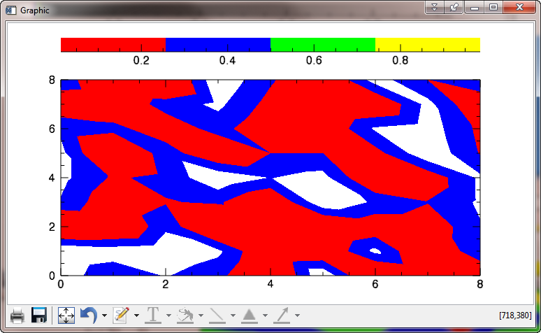 |
| The colors in the color bar are now correct. |
To make the colors in the contour plot match the colors in the color bar, you must set the levels in such a way that the levels vector includes both the minimum value of the data and the maximum value. This is different from how this is done in direct graphics, where the maximum value is assumed. In our case, the levels vector must be created like this.
levels = [0.00, 0.25, 0.50, 0.75, 1.00]
Note that if you are using the N_LEVELS keyword to specify your contour levels, instead of the C_VALUES keyword, as we are here, the above requirement means that you will have to specify N_LEVELS to be one more than the actual number of levels you want to create. In other words, to see a filled contour plot with four colors, you would specify N_LEVELS=5.
Note the way we are byte scaling the indices that we pass to RGB_INDICES. If this is not done the contour plot will come out completely red. I am told this is bug in IDL 8.1, and that the RGB_INDICES keyword does not work as it is described in the documentation, and will be fixed in the next release of IDL.
   levels = [0.00, 0.25, 0.50, 0.75, 1.00]
   w = Window(DIMENSIONS=[750, 400])
   c = Contour(data, /CURRENT, C_VALUE=levels, /FILL, $
       POSITION=[0.1, 0.1, 0.9, 0.8], AXIS_STYLE=2, $
       RGB_TABLE=rgb, RGB_INDICES=BytScl(Indgen(4)))
   cb = Colorbar(TARGET=c, POSITION=[0.1, 0.90, 0.9, 0.95])
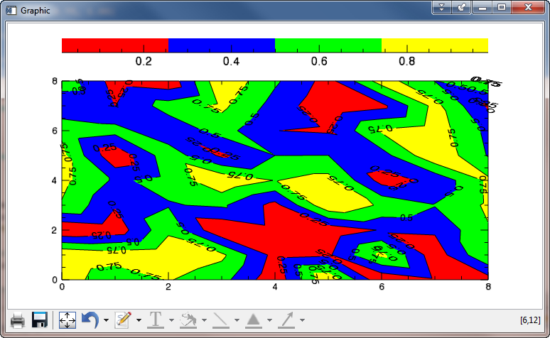
You see it appears we are making progress in the figure below.
 |
| The colors in our contour plot seem to be correct now! |
Of course, the color bar is labeled oddly, and the contour plot is not labeled at all, but these problems are easily fixed. (We hope!)
Let's start by labeling the contour levels on the contour plot itself. This is normally done by simply overplotting the contour lines on the filled contour plot. As in the first figure above, we would like the contour labels to be a bit smaller than the annotation on the contour axes, so we will use the FONT_SIZE keyword to set the value to a 10 point type, rather than the default 14 point. Also, we have to switch the levels back to what we were trying to use originally. We use the C_LABEL_SHOW keyword to indicate that all of the contour lines should be labeled.
   w = Window(DIMENSIONS=[750, 400])
   levels = [0.00, 0.25, 0.50, 0.75, 1.00]
   c = Contour(data, /CURRENT, C_VALUE=levels, /FILL, $
       POSITION=[0.1, 0.1, 0.9, 0.8], AXIS_STYLE=2, $
       RGB_TABLE=rgb, RGB_INDICES=BytScl(Indgen(4)))
   over = Contour(data, /CURRENT, C_VALUE=levels, /OVERPLOT, $
       C_COLOR='black', FONT_SIZE=10, C_LABEL_SHOW=Replicate(1,4))
   cb = Colorbar(TARGET=c, POSITION=[0.1, 0.90, 0.9, 0.95])
That seems to have done the job! Although it appears half the contour labels are upside down, and the annotations on the original contour plot have shrunk for some reason to the size of the contour overplot annotations, as shown in the figure below. (They are suppose to match the color bar annotations.)
 |
| The contour annotations are often upside down, and the overplot size has affected the orginal contour plot axes labels! |
The upside-down contour annotation problem is easily fixed. We simply need to set the C_USE_LABEL_ORIENTATION keyword. (On every contour plot where we don't want upside-down contour labels. Sigh...)
The font size problem is a result of not understanding the "new graphics" way of doing things. In "new graphics" we need to overplot the contour lines before we actually draw the contour plot! Then you have to move the contour lines (the overplot) in front of the filled contour plot. The code should look like this.
   w = Window(DIMENSIONS=[750, 400])
   levels = [0.00, 0.25, 0.50, 0.75, 1.00]
   over = Contour(data, /CURRENT, C_VALUE=levels, AXIS_STYLE=0, $
       C_COLOR='black', FONT_SIZE=10, C_LABEL_SHOW=Replicate(1,4), $
       C_USE_LABEL_ORIENTATION=1, POSITION=[0.1, 0.1, 0.9, 0.8])
   c = Contour(data, /CURRENT, C_VALUE=levels, /FILL, $
       POSITION=[0.1, 0.1, 0.9, 0.8], AXIS_STYLE=2, $
       RGB_TABLE=rgb, RGB_INDICES=BytScl(Indgen(4)))
   over.Order, /BRING_FORWARD
   cb = Colorbar(TARGET=c, POSITION=[0.1, 0.90, 0.9, 0.95])
I know it's a little wierd to see the overplotted lines in the window for 3-4 seconds before the filled contour plot actually shows up, but that's just how it works. You see the final result (after 8-10 seconds) in the figure below. Notice, too, the fuzzy labels in the upper right corner of the contour plot.
 |
| The contour plot is looking good! Only the color bar to deal with now, and maybe the fuzzy labels in the upper right-hand corner of the plot. |
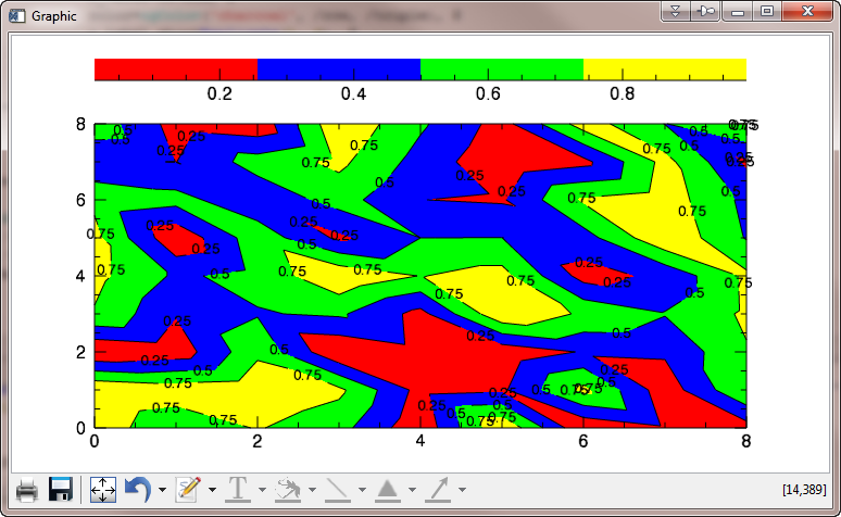
The fuzzy labels are due to the fact that a very short contour line has been labeled twice by the contour algorithm. To avoid this problem, we need to "thin" the contour labels. Presumably we are expected to "thin" the contour labels until we see no more fuzzy labels. We can use the C_LABEL_INTERVAL keyword to do this. A value of 0.6 works well in this instance. At the same time, we will prevent the window from updating or refreshing until we have done all our strange machinations to get the contour plot working correctly!
   w = Window(DIMENSIONS=[750, 400])
   w.Refresh, /DISABLE
   levels = [0.00, 0.25, 0.50, 0.75, 1.00]
   over = Contour(data, /CURRENT, C_VALUE=levels, AXIS_STYLE=0, $
       C_COLOR='black', FONT_SIZE=10, C_LABEL_SHOW=Replicate(1,4), $
       C_USE_LABEL_ORIENTATION=1, POSITION=[0.1, 0.1, 0.9, 0.8], $
       C_LABEL_INTERVAL=0.6)
   c = Contour(data, /CURRENT, C_VALUE=levels, /FILL, $
       POSITION=[0.1, 0.1, 0.9, 0.8], AXIS_STYLE=2, $
       RGB_TABLE=rgb, RGB_INDICES=BytScl(Indgen(4)))
   over.Order, /BRING_FORWARD
   cb = Colorbar(TARGET=c, POSITION=[0.1, 0.90, 0.9, 0.95])
   w.Refresh
You see the result in the figure below.
 |
| The contour labels have been "thinned" to prevent label fuzziness. |
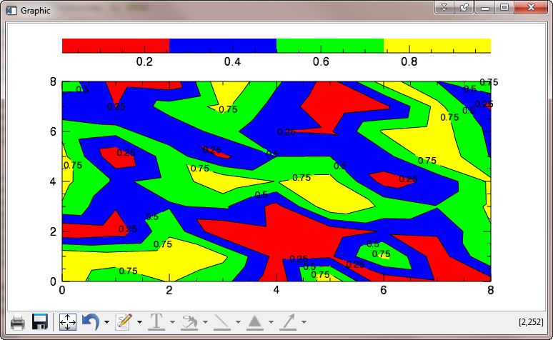
OK, finally we are ready to fix the labeling of the color bar and we are finished! Clearly, the only problem with the color bar is that it chooses four major tick marks by default and we want five. The MAJOR keyword is used to determine the number of major tick marks the colorbar uses. The code looks like this.
   w = Window(DIMENSIONS=[750, 400])
   w.Refresh, /DISABLE
   levels = [0.00, 0.25, 0.50, 0.75, 1.00]
   over = Contour(data, /CURRENT, C_VALUE=levels, AXIS_STYLE=0, $
       C_COLOR='black', FONT_SIZE=10, C_LABEL_SHOW=Replicate(1,4), $
       C_USE_LABEL_ORIENTATION=1, POSITION=[0.1, 0.1, 0.9, 0.8], $
       C_LABEL_INTERVAL=0.6)
   c = Contour(data, /CURRENT, C_VALUE=levels, /FILL, $
       POSITION=[0.1, 0.1, 0.9, 0.8], AXIS_STYLE=2, $
       RGB_TABLE=rgb, RGB_INDICES=BytScl(Indgen(4)))
   over.Order, /BRING_FORWARD
   cb = Colorbar(TARGET=c, POSITION=[0.1, 0.90, 0.9, 0.95], MAJOR=5)
   w.Refresh
You see the results in the figure below. Oh oh! The data ranges are almost right, but not what I want.
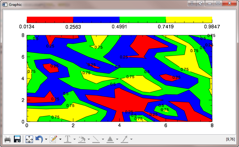 |
| Tick tick marks on the color bar are in the right place (more or less) now, but the data range is wrong. |
The problem here is that is not possible to independently set the range of the color bar in IDL 8.1. In fact, the color bar takes its range from the contour plot data itself (which is its target). This data has a minumum value of 0.0134 and a maximum value of 0.9847. Thus, all of our tick marks are off. (As are the colors, but the discrepancy is too small to see easily here.)
One could probably fix the labeling problem (although not underlying problem with the Colorbar() function) by simply fudging the tick labels with the TICKNAME keyword.
To truly fix the problem and get the color bar to do the proper labeling for you, you need to create a fake contour plot with the data range set to exactly the data range you want to display on the color bar. Then, you will use that fake contour plot as the target for the color bar, instead of the contour plot you are actually drawing. The idea is to use the data in the real contour plot, but set the z-values to the exact data range. The fake contour plot can be "hidden" by setting the HIDE keyword. This way, it doesn't show up on the display and disrupt what is already there. The code looks like this.
   w = Window(DIMENSIONS=[750, 400])
   w.Refresh, /DISABLE
   levels = [0.00, 0.25, 0.50, 0.75, 1.00]
   over = Contour(data, /CURRENT, C_VALUE=levels, AXIS_STYLE=0, $
       C_COLOR='black', FONT_SIZE=10, C_LABEL_SHOW=Replicate(1,4), $
       C_USE_LABEL_ORIENTATION=1, POSITION=[0.1, 0.1, 0.9, 0.8], $
       C_LABEL_INTERVAL=0.6)
   c = Contour(data, /CURRENT, C_VALUE=levels, /FILL, $
       POSITION=[0.1, 0.1, 0.9, 0.8], AXIS_STYLE=2, $
       RGB_TABLE=rgb, RGB_INDICES=BytScl(Indgen(4)))
   over.Order, /BRING_FORWARD
   c.GetData, z, x, y
   z[0] = 0.0 & z[1] = 1.0
   fakeContourPlot = Contour(z, /CURRENT, C_VALUE=levels, /FILL, $
       POSITION=[0.1, 0.1, 0.9, 0.8], AXIS_STYLE=2, $
       RGB_TABLE=rgb, RGB_INDICES=BytScl(Indgen(4)), HIDE=1)
   cb = Colorbar(TARGET=fakeContourPlot , POSITION=[0.1, 0.90, 0.9, 0.95], MAJOR=5)
    w.Refresh
You see the final result in the figure below. Note that the contour plot doesn't look exactly like the contour plot in the first figure, but this is because the object graphics contour command uses a different contouring algorithm than the direct graphics contour command uses. It is not possible to say which is "correct." Or, rather, there are an infinite number of ways to draw a contour line, all of which can theoretically be considered "correct."
 |
| The contour plot in its final form. |
Any other questions? This is about as simple as teaching an elephant to dance. Sheesh!
![]()
IDL 8.2 Update
The situation with contour plots and color bars has improved a little bit in IDL 8.2. You still have to create the contour lines before you create the filled contour plot, and the colorbar documentation can still lead you a little bit astray. But, it is at least possible to create the right plot now.
Here is the code I would use in IDL 8.2 to create this contour plot.
   ; Create the data and the contour levels.
   data = RandomU(-3L, 9, 9)
   levels =[0.0, 0.25, 0.5, 0.75]

   ; Create an RGB_TABLE for the contour plots.
   rgb = cgColor(['red', 'blue', 'green', 'yellow'], /TRIPLE)

   ; Create the contour lines. Must be done BEFORE the filled contour,
   ; or the filled contour axis annotations will be too small.
   out = Contour(data, C_VALUE=levels, FONT_SIZE=10, /C_LABEL_SHOW, C_USE_LABEL_ORIENTATION=1,  $
          C_LABEL_INTERVAL=0.6, POSITION=[0.1, 0.1, 0.9, 0.8])

   ; Create the filled contour and overplot it on the contour lines.
   c = Contour(data, C_VALUE=levels, /FILL, RGB_TABLE=rgb, RGB_INDICES=indgen(4), $
            POSITION=[0.1, 0.1, 0.9, 0.8], /OVERPLOT)

   ; Now bring the contour lines forward on the display.
   out.order, /Bring_Forward

   ; Finally, create the colorbar.
   tickname = STRING(INDGEN(5)/4.0, FORMAT='(F0.2)')
   cb = Colorbar(POSITION=[0.1,0.87,0.9,0.92], RGB_TABLE=rgb, $
       TICKNAME=tickname, BORDER=1)
You see the result of these commands in the figure below.
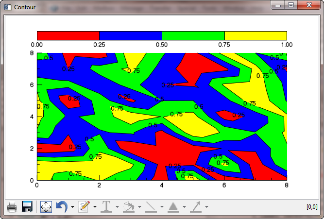 |
| The contour plot in IDL 8.2 |
![]()
Version of IDL used to prepare this article: IDL 8.1.
![]()
![]()
Updated: 13 September 2011
Updated: 28 August 2012


